Color has a huge influence on how a home looks and feels, but most people stick to the same familiar names. Blue, green, red, pink, beige, gray. Those are easy to picture, but they do not always capture the full personality of a shade. That is where unusual color names become more interesting.
A name like vermillion feels richer than simply saying red. Aubergine sounds moodier than purple. Ecru has much more texture and warmth than off-white. These names do more than describe color. They suggest mood, history, and style. They can help you think about your home in a more layered way and make it easier to build a space that feels more personal.
The good news is that you do not need to redesign an entire room around one bold shade. Sometimes all it takes is a pillow, a lamp base, artwork, or one well-chosen vintage piece to make a space feel more alive.
If you want to expand your color vocabulary and use color in a more thoughtful way, here are eight unusual color names worth knowing and practical ideas for bringing them into your home.
Why Unusual Color Names Matter in Home Design
Unusual color names can sound decorative or even a little dramatic, but they are useful. They help you move beyond basic color categories and notice more specific tones and undertones.
That matters when you are decorating because not all reds feel the same, not all greens create the same mood, and not all neutrals behave like safe background shades. A room can feel warm, cool, dramatic, soft, earthy, or playful depending on the exact version of a color you choose.
Learning a few more nuanced names also helps when you are shopping secondhand. Vintage and pre-owned home decor often come in finishes, fabrics, and details that do not fit into simple color labels. A chair may not be just purple. It may be aubergine. A lamp base may not be simply green. It may lean chartreuse or celadon. Once you start seeing those differences, it becomes easier to mix pieces with more confidence.
1. Vermillion
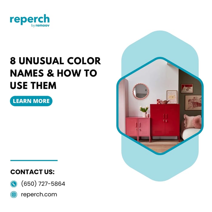
Vermillion is a bold, rich red with orange undertones. It feels energetic, warm, and slightly dramatic without being as dark as burgundy or as bright as a true fire-engine red.
This is one of those colors that immediately pulls attention, so it works best when you want a room to have a little more life. Vermillion can bring warmth into neutral spaces and help a room feel more intentional.
How to use vermillion at home
Vermillion works well in smaller doses if you are nervous about bold color. A throw pillow, ceramic vase, framed artwork, or accent chair can add impact without overwhelming the room. In a more eclectic or collected space, vermillion can also work beautifully in a patterned rug or vintage textile.
If you like stronger color, a vermillion painted side table or a single statement lamp can help break up a room full of wood tones and soft neutrals.
What it pairs well with
Vermillion looks especially strong with cream, black, warm wood, deep navy, and brass. It can also work well with pale walls because the contrast makes the color feel even more vivid.
2. Aubergine
Aubergine is a deep eggplant purple with a brownish, moody richness to it. It feels more grown-up than lavender and softer than black, which makes it a very useful color for interiors.
Aubergine is often overlooked because people assume purple will feel too decorative or too difficult to style. In reality, this shade can act almost like a neutral when used thoughtfully.
How to use aubergine at home
Aubergine is especially good for bedrooms, reading corners, or living rooms where you want a cozier, more layered mood. It can show up in velvet upholstery, painted furniture, a throw blanket, or even just a few decorative accessories.
If you want a room to feel deeper and more intimate, aubergine works beautifully as an accent wall color, especially with softer lighting and lighter furniture nearby.
What it pairs well with
This shade looks elegant with walnut, oak, brass, cream, camel, and dusty pink. It also works surprisingly well with olive tones and soft grays.
3. Salmon
Salmon is a soft pink-orange shade that feels warmer and earthier than blush. It has an easy livable quality that makes it more versatile than many people expect.
Because it sits between pink and orange, salmon can bring warmth into a room without feeling overly sweet or overly bright. It can soften modern spaces and add freshness to traditional ones.
How to use salmon at home
Salmon is a great choice for textiles and accessories. It works well in throw pillows, bedding, curtains, and art. In a dining room or breakfast nook, salmon can also feel cheerful and welcoming without being too loud.
If you want to try it in furniture, a salmon-toned upholstered bench or accent chair can make a room feel instantly more layered.
What it pairs well with
Salmon looks especially good with olive green, soft blue, warm white, light wood, and woven natural textures. It also works beautifully with deeper greens if you want a slightly more sophisticated contrast.
4. Indigo
Indigo sits between blue and violet, though most people experience it as a deep, inky blue. It feels classic, grounded, and slightly dramatic, which makes it one of the easiest unusual color names to use in the home.
Indigo has enough depth to feel rich but not so much intensity that it becomes hard to live with. It can make a room feel calmer without losing character.
How to use indigo at home
This is a wonderful color for larger pieces. Indigo works beautifully in sofas, upholstered chairs, rugs, and curtains. It is also strong enough to be used on painted cabinetry or built-ins if you want a room to feel more tailored.
If that feels like too much, indigo can still make an impact through smaller details like lamp shades, ceramics, or patterned cushions.
What it pairs well with
Indigo goes with almost everything. White, cream, cognac leather, brass, natural oak, soft pink, and even mustard all tend to work well with it. That flexibility is one reason it remains so popular.
5. Cyan
Cyan is a bright blue with a clear, energetic quality. It feels cleaner and sharper than teal and lighter than navy. It has a fresh, almost electric look that can wake up a room very quickly.
Because cyan is more vivid than many standard interior blues, it works best when you want to introduce a more playful or modern edge.
How to use cyan at home
This is usually not the color people choose for a full sofa or large cabinet unless they are committed to a bold look. But cyan can be excellent in artwork, glass objects, vases, painted frames, and patterned textiles.
In bathrooms, kids’ rooms, or casual spaces, cyan can feel especially fresh. It also works in homes that already have a lot of white or pale neutral surfaces and need a little contrast.
What it pairs well with
Cyan looks crisp with black, gray, white, pale wood, and chrome. It can also work with coral or salmon if you want a more playful color mix.
6. Chartreuse
Chartreuse is a yellow-green shade with real personality. It is vibrant, unexpected, and definitely not shy. Some versions lean more green, while others feel warmer and more yellow.
This is one of those colors that can feel intimidating in theory but amazing in the right context. When used well, chartreuse brings energy and freshness into a room in a way few other colors can.
How to use chartreuse at home
Chartreuse is often best as an accent color. A single chartreuse cushion, glass vase, side chair, or piece of abstract art can completely shift the mood of a neutral room. It is especially useful when a space feels flat and needs a little tension or contrast.
If you like a more eclectic look, chartreuse can also work in patterned upholstery or decorative ceramics.
What it pairs well with
This shade works especially well with walnut, black, charcoal, navy, and rich jewel tones. It can also add life to beige or cream rooms that need a more modern edge.
7. Mauve
Mauve is a dusty, muted mix of pink and purple. It is softer than aubergine and less sugary than pastel pink, which makes it feel very livable. Mauve has a slightly vintage quality, but it can also look modern depending on what you pair it with.
This is a good color for people who want warmth and softness without going overly feminine or decorative.
How to use mauve at home
Mauve works beautifully in bedrooms, living rooms, and soft sitting areas. Upholstery, curtains, bedding, and accent pillows are easy places to bring it in. It can also be lovely on painted furniture if you want an old piece to feel fresher and more interesting.
Because it is muted, mauve tends to blend more easily into a room than brighter pinks or purples.
What it pairs well with
Mauve looks strong with natural wood, cream, warm gray, black, and olive. It can also work nicely with brass and linen textures if you want the room to feel softer and more relaxed.
8. Ecru
Ecru is a warm, unbleached neutral that sits somewhere between beige, cream, and soft stone. It may sound less exciting than the other shades on this list, but it is one of the most useful.
Unlike cooler whites, ecru has softness built in. It can make a space feel natural, quiet, and welcoming. It is especially good if you want a room to feel calm without becoming stark or flat.
How to use ecru at home
Ecru works almost anywhere. It is perfect for walls, slipcovers, rugs, curtains, bedding, and upholstery. It also helps vintage wood furniture stand out without making the room feel too heavy.
If you are trying to create a layered neutral home, ecru is one of the best base shades to build around.
What it pairs well with
Almost everything. Ecru works with black, brown, olive, navy, rust, brass, pale pink, and nearly every wood tone. That flexibility is what makes it so valuable.
How to Use Bold and Unusual Colors Without Overdoing It
One reason people avoid unusual colors is that they worry they will regret them. That is a fair concern, especially with larger pieces. The easiest way to avoid that problem is to think in layers.
Start with one of these approaches:
Choose one unusual shade and repeat it in two or three small places throughout the room.
Use a neutral room as the base and let one unusual color act as the accent.
Try the color first in something easy to move or replace, like a pillow, vase, or lamp.
Balance stronger colors with natural materials like wood, linen, leather, and woven textures.
This makes the room feel intentional without making it feel like a color experiment gone wrong.
You can also borrow ideas from broader living room decorating ideas if you want to test a color in a way that feels flexible rather than permanent. Color often works best when it is layered through art, textiles, and small furnishings instead of introduced all at once.
Why Secondhand Furniture Makes Color More Interesting
One of the best things about shopping secondhand is that color often feels more original. New furniture tends to repeat the same safe palette over and over. Gray, beige, white, black. Those colors are easy to sell, but they are not always the most interesting.
Used home decor and vintage furniture often bring in shades that feel more nuanced and more memorable. You may find a chair in aubergine velvet, a lamp base in indigo ceramic, a side table painted salmon, or a rug with unexpected bits of vermillion and chartreuse running through it. Those pieces can help a room feel less staged and more personal.
That is one reason Reperch makes color experimentation easier. Instead of filling your home with the same mass-produced palette everyone else has, you can find secondhand pieces with more texture, more personality, and more visual depth. That makes it easier to use unusual colors in a way that feels collected rather than forced.
Lighting matters here too. The same unusual shade can feel dramatically different depending on where it is placed and how it is lit. A color that feels flat in a dark corner may come alive beside a window or under the right table lamps in your home decor.
Final Thoughts
Learning unusual color names is not just about sounding more design-savvy. It is about seeing color more clearly and using it more intentionally in your home.
Vermillion can add warmth and energy. Aubergine brings mood and richness. Salmon softens a room. Indigo grounds it. Cyan freshens it. Chartreuse wakes it up. Mauve adds quiet elegance. Ecru gives you a soft, versatile neutral that works almost anywhere.
You do not need to use all eight. Often, one or two are enough to change the way a room feels.
The best spaces usually are not built from safe choices alone. They come together through a mix of texture, shape, and color that feels personal. Sometimes all it takes is one unusual shade to make everything else look more thoughtful.